


👩🏻💻🎉 Faster Internet For All!

Happy Hump Day everyone,
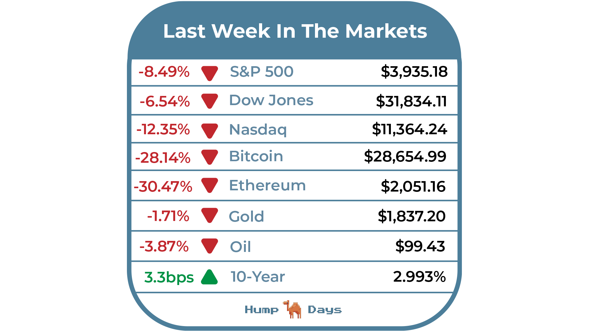
This past week, Tom Brady signed with Fox Sports as an analyst after he eventually retires, Grindr takes the SPAC route to go public, the first F1 Grand Prix in Miami was a huge success, big Chinese companies are facing delisting in the U.S., the U.S. trade deficit continued to swell as imports surged, and the S&P suffered the longest weekly losing streak in a decade.
I’ll be in Nashville this weekend for a wedding, so if you have any recommendations on where to eat or what to do, please reply to this email and let me know!
Let’s make it over another Hump! Enjoy!
- Humphrey, Rickie & Tim.
In the Markets
Featured Story
The Biden administration put in legislation earlier last year, part of the bipartisan infrastructure law, in an effort to connect millions of unconnected households to the internet. On Monday, it was announced that 20 internet providers, including AT&T Inc., Comcast and Verizon had agreed to improve subsidize high-speed internet plans for millions of Americans.
This legislation is significant because over 1/3 of the country is eligible for the $30/month discount. The big task will be getting the subsidy out to as many eligible households as possible as many of the neediest users aren’t even online in the first place. If this program does in fact succeed, it will be a major boost for providers, according to analysts.
Take a look at this map from The Verge which outlines exactly what this new legislation is trying to solve. Each grey area represents a county wherein less than 15% of people are using internet at 25Mbps or above.

The pandemic has changed the way we work and earn money. No longer are we confined by our ZIP cods to work well paying jobs and earn a living. With more and more every day proceedings moving online such as court sessions, city council meetings, and university lectures, high-speed internet turned from a luxury to a necessity in the span of a few weeks.
The target that the Biden administration is trying to hit is bringing broadband to 98% of households. By doing this, telecom providers have an increased customer base, people unable to find work become exposed to an entire global job economy online, and underserved American’s can build, connect, and trade from the comfort of their own homes in a way they could never have before.
The first step though, is to take a long look at the grey areas of the map above and think about what it will take to truly get them online. Are higher speeds enough? Is cheaper internet big enough of an incentive or is there more to it? Only time will tell.
Weekly News Roundup
Biden, Internet Providers Seek to Boost Adoption of Subsidized Broadband (WSJ)
Twenty internet providers including AT&T, Comcast and Verizon have agreed to improve subsidized high-speed internet plans. Many of the companies had agreed on Monday to either boost the internet speeds that they offer through the program or to cut their rates to $30 a month for low-income households.
HY: Finally. Feels like America is hard to get “right” infrastructure wise due to its large land size and spread out households. Glad to see there’s an initiative to get everyone internet access that is faster.
Elon Musk Secures $7.1 Billion in Financing for Twitter (Bloomberg)
Elon Musk has secured ~$7.1B in new financing commitments from various sources including billionaire Larry Ellison, Saudi Prince Alwaleed, and the CEO of Binance. Musk is expected to serve as temporary CEO of Twitter for a few months after the deal is expected to close later this year.
RH: Given the eclectic sources of Musk’s financing, it could be inviting U.S. scrutiny as to who gets to have influence on American social media platforms just like TikTok in 2020.
HY: Still a bit bearish on the uncertainty of the situation for the time being, but once/if the deal closes I’ll be more bullish on Elon and Twitter.
Saudis Cut Oil Prices from Record Highs Amid China Lockdowns (Bloomberg)
Saudi Arabia cut oil prices for buyers in Asia as coronavirus lockdowns in China weigh on demand. Saudi Aramco also lowered all grades for the north west Europe region and almost all for the Mediterranean. Prices for U.S. customers remained unchanged from May, however.
HY: I was trying to make a video on Tik Tok for when gas prices were expected to come down… the short conclusion I came to was that they probably won’t come down anytime soon, Fall at the earliest, or unless the war in Ukraine ends suddenly. RIP.
Chart of the Week
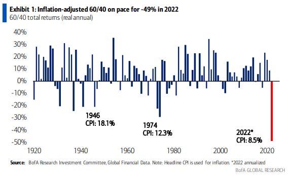
We are truly living in historic times. Unfortunately, there is just nowhere to hide and the best thing we can do at this point is just not check our portfolios. 🙈
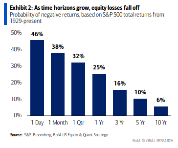
While it is painful, remember that it is best to stay invested in the market through thick and thin. Bank of America found that since the 1930s, if you sat out the 10 best days per decade, your returns would be just 45% vs. ~20,000%…
Hey Humphrey and Team. I think you guys misread the chart that shows internet use per county. It is the BLUE areas with counties where less than 15% of internet users have or use 25mbps or above speeds and not the gray which makes sense as all the major cities are gray. Big fan of your work and youtube!
Regards,
Snow